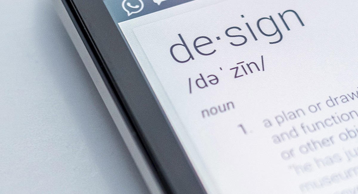
A New Decade for Design
Every year we sink further and further into the virtual world in our hands. Companies have already adapted and are pushing the importance of digital advertising. By now, you can assume everything from top name brands to small, local shops have acquired their own real estate in our phones, computers and tablets. Now it is a new decade and brands are still asking the question “how can we BE better?” At the swipe of our fingertips we emerge ourselves in visual engagement, but it isn’t just about being visually appealing anymore. In 2021, companies must find a way to not only captivate our eyes, but to connect on a deeper, more meaningful level with its audience that is worth the 8 seconds of their time.
1. Sweet and Simple
In the fast-paced world we reside in, we must find way to capture the viewers’ attention within seconds. According to a study by Microsoft, our attention spans have decreased from 12 seconds to about 8 seconds in the last 20 years. We will start seeing designers take on the challenge of telling the story with as little time as possible. We will start seeing more monochrome emerging. With using only shades and tints of one color, it allows our eyes and brains to take a breather and not have to work as hard distinguishing through multiple colors. This allows us to take in only the information we need.

2. Organic and Earthly
While we start moving towards a more green and sustainable way of living, our way of communicating will follow. With digital advertising, earthy colors and organic shapes will become more visually appealing to most. This tells our minds to associate these colors/shapes with being eco-friendly, which will continue to be highly desired. If we take a step further into physical design, such as print and packaging, brands will become more devoted to eco-friendly papers and packaging throughout this decade. Who doesn’t want to help save the planet?

3. Heavy but clean type
Creating hierarchy is very important in design. According to AdEspresso, a typical ad headline should only be 5 words. It is the designer’s job to make those 5 words stand out to the audience and it should make the viewer want to read the subtext. Creating a large, bold headline will catch the viewer's eye, but something as simple as not using a clean font can turn their interest off right away. If you ask a designer how many hours they spend scrolling through fonts to find the perfect one for their clients message, it is probably WAY more than you think.

4. Type-heavy logos
No matter what place in time we are in, brands strive to stand out. Moving forward, we will see brands start to stray away from icons and symbols and start using unique typefaces. With so little time to captivate their audience, brands can no longer train consumers to associate an icon to a name. With modern technology, creating unique typeface for brands will start to surface more and designers will work to make the brand name an icon in itself.

5. More Motion
Last decade we saw the huge affection of boomerangs, GIFs and funny filters. These viral sensations will certainly not be left in the 2010s and will only become larger in the 20s. We will see an advancement in animated logos and companies using GIFs and filters as a part of their brand awareness.